REAL ESTATE PROJECT
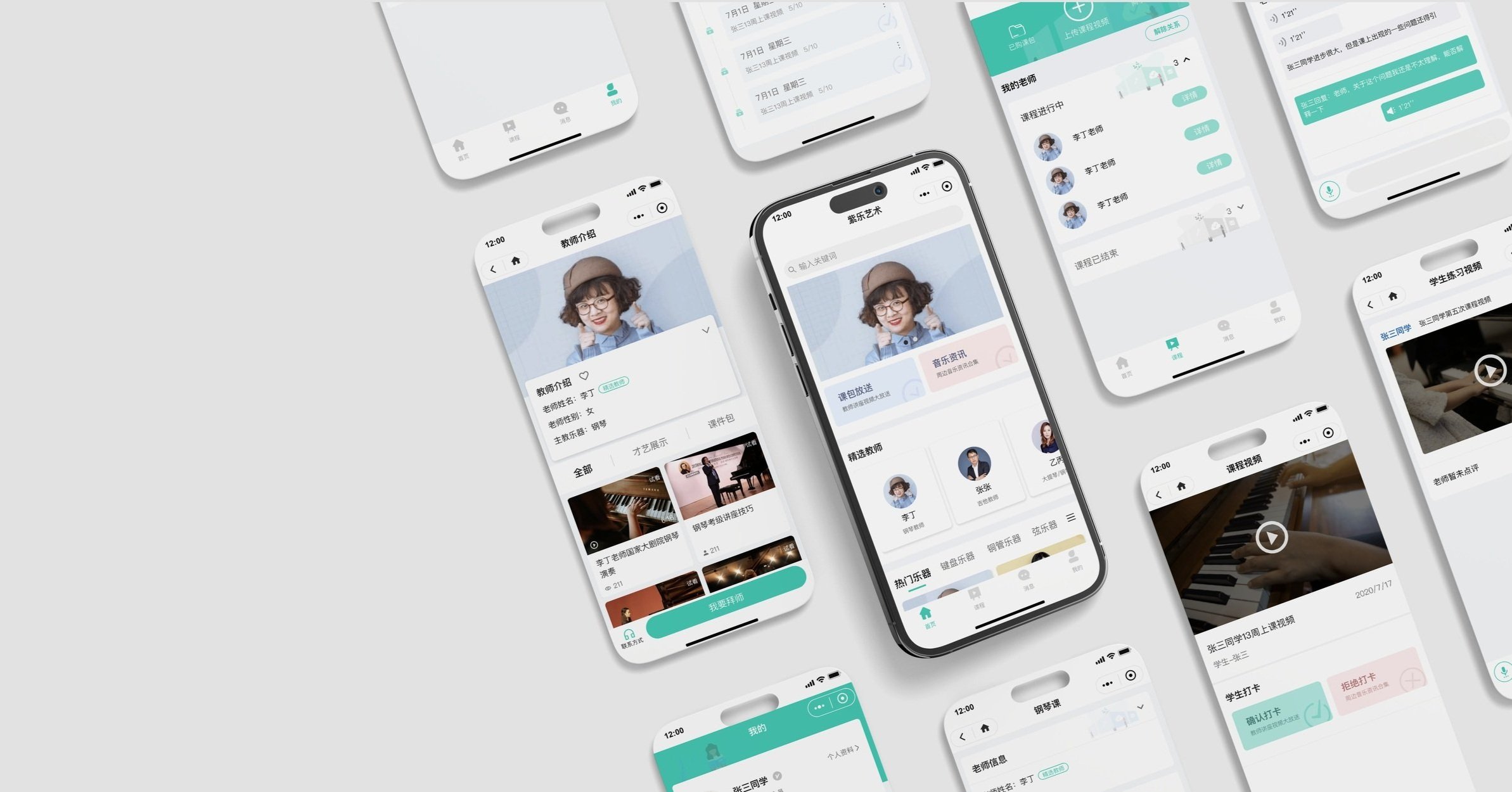
Ziyue Online Music Tutor
WeChat Mini Program Design
Contexts
The objective of this project is to design a digital solution for the company. The design is to visually communicate the company's mission that provides users a platform in order to help students effectively reach out to tutors based on their own needs and enable tutors to find students and gradually build a reputation.
Timeline: May 2020 -Nov 2020
Team: Yanfei Xiang, Yadie Rao, Kexin Huang, Lingyan Chen
Tools:
My Role
User Research
Wireframe
Workflow
Low-fi prototype
Usability Tests
Challenge
There is a lack of communication between music tutors and students.
Students: hard to find a appropriate tutor.
Young Tutors: find it time-consuming to build reputation and recruit students.
“ Where can I find a piano tutor? Senior tutors are all fully booked…“
“ How can I find students, it’s just so difficult to recruit before building up a reputation… “
How might we design a platform to bridge young tutors and students, breaking the gap?
User Research
Conditions:
As a start-up company, Ziyue only had limited budget and time for the user research.
Solution to that :
By interviewing students, parents and teachers of nearby conservatories, we cut down most of the cost and still attained some information of users’ demands.
The findings :
There is a information gap in between students and young tutors, and it often takes 2 - 3 referees for a student to finally reach to a corresponding tutor.
The digital platforms are mostly used within students and tutors: VIP, WeChat, Tencent Class.
Competitors Analysis
Before diving into the design process, we did around of competitive analysis to learn the current mostly used tools: what they are doing well or not well, and what features that they are lacking.
VIP
Pros
Platform ease of access for teacher-student connections
Highly focus on the music tutorial
Cons
Limited instrument coverage, lack of inclusiveness
Only one-lessons a time reservation system hinders building long-term teacher-student relationship
Tencent Class
Pros
Comprehensive coverage of subjects
Large platform with a high number of teachers and students
Opportunity for teacher branding.
Cons
Only offering courses in a series, without the option for one-on-one lessons.
Lacking targeted focus, it is just one module among many on the platform.
Pros
Having a large user base as a former primary platform for the communication
Functions as a communication tool
Cons
Requiring an intermediary introduction for students to contact teachers.
Teachers can only wait passively for students to make contact.
Initial Prototypes
We developed three initial prototypes and we recommended the WeChat Mini Program as a solution, since it costs less on establishment and maintenance, and can rely on the existing WeChat user base, which is more consistent with user habits.
APP
Why we rejected it?
High initial investment and maintenance costs.
Web
Why we rejected it?
Low utilization rate of the website, not aligned with user habits.
WeChat Mini Program
Why we accepted it?
Low establishment cost with a focus on WeChat as the main user platform, getting a larger user base.
Functional Structure
We have expanded upon the initial prototype and refined our functional structure through continuous communication with the client.
User Flow & Iteration
What I contributed:
The “Course“, “Notification“ and “Me“ sections.
The payment process of both students and tutors.
User flow for students
My Works
What’s the problem:
The WeChat Mini Program on iOS devices did not support payment for virtual services or recharging.
The solution I proposed:
To solve this, I developed several plans, and refined the selected one with other functional team.
Redirecting to an external webpage for payment each time.
(The user flow is too complicated) ❌
Recharging through the WeChat public account.
(Not compliant with technical specifications) ❌
Redirect users to an external webpage for payment and provide their exclusive payment link through the WeChat public account.
👍
User flow for tutors
Prototype & Usability Test
During the low-fidelity prototyping, I was mainly responsible for the design of the "Courses," "Messages," and "Me" sections, as well as collaborating with my team to ensure seamless transitions between all pages.
Home Page
Discover nearby music teachers and their relevant subjects.
Obtain information related to music, such as concerts and music competitions.
Tutor Introduction
Introduce teacher information, such as their instrument specialties, number of students, and personal profiles.
Showcase teacher proficiency through talent showcases.
Offer special courses that can be subscribed to.
Me
Manage balance and points.
Manage purchases, applications, and collections.
Edit personal information.
Lesson Check-in
View the recorded video of the class
Confirm the check-in
Upload post-class practice video
Special Courses
Browse course introductions.
Understand the contents of a course.
Learn about the course's instructor.
For teachers: they can promote themselves through special courses to attract students.
For students: they can gain a deeper understanding of the teacher through short courses.
Practice Review
After students upload their practice videos, the teacher receives a notification.
The teacher provides feedback through either audio or written comments.
Students can also ask questions in real-time.
Testing the prototype with the engineering team
Creating a comprehensive interaction document to ensure consistency and clarity in the user experience.
Debugging and fixing any glitches or issues to improve the overall functioning of the project.
Final Design
In the final high-fi phase, I primarily took charge of maintaining and defining the visual design standards to ensure that the visual effects and user experience of the entire project met the necessary requirements.


